29 January
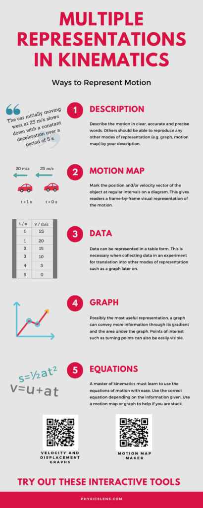
This is another Infographic made using Canva last year.
the world in a different light
This is another Infographic made using Canva last year.
An interesting paper on the range of penguin’s poop. Their motivation? “Such information is useful for keepers to avoid the direct hitting of faeceses.”
Source: https://arxiv.org/pdf/2007.00926.pdf?fbclid=IwAR2Y6CkFXeCrJH7nxf624To8RcpdRSs0e3_COto9ev6MK-Z_wnObeRHvVlg
In a recent class on Kinematics, I prepared a string of 4 pendulum balls, each separated about 20 cm apart and dropped them from a height. Before that, I got students to predict whether the intervals in time between drops will be constant, increasing or decreasing.

Most students are able to predict rightly that the intervals will be decreasing and explain their reasoning.
What challenged me was this: previously, we had to listen to the intervals of sound to verify the answer. I had tried using laptop software such as Audacity to record the sound before. However, I wanted students to be involved in this verification process. PhyPhox enabled that.
With each student being able to download the mobile app into their phones, all I needed to do was to ensure everyone uses the correct setting: the Audio Scope setting and to change their range to the maximum duration (500 ms). They then had to be familiar with the play and pause button so they can stop the measurement in time to see the waveform.
I then did a countdown before dropping the balls. This is an example of the graph obtained.

Through this graph, you can see that:
Through this GeoGebra app, students can observe how the gradient of the displacement-time graph gives the instantaneous velocity and how the area under the velocity-time graph gives the change in displacement.
In the GeoGebra app below, you will see a displacement-time graph on the left and its corresponding velocity-time graph on the right. These graphs will be referring to the same motion occuring in a straight line. Instructions
This GeoGebra app allows students to observe the difference between instantaneous and average velocity from a graphical perspective.
As one of the first topics in A-level physics, kinematics introduces JC students to the variation of velocity and displacement with acceleration. Very often, they struggle with the graphical representations of the 3 variables.
This Geogebra app allows students to vary acceleration (keeping it to a linear function for simplicity) while observing changes to velocity and displacement. Students can also change the initial conditions of velocity and displacement.
The default setting shows an object being thrown upwards with downward gravitational acceleration of 10 m s-2.
The movement of the particle with time is shown on the left with a reference line showing the position on the displacement graph.
GeoGebra link: https://www.geogebra.org/m/qpxcs6vb