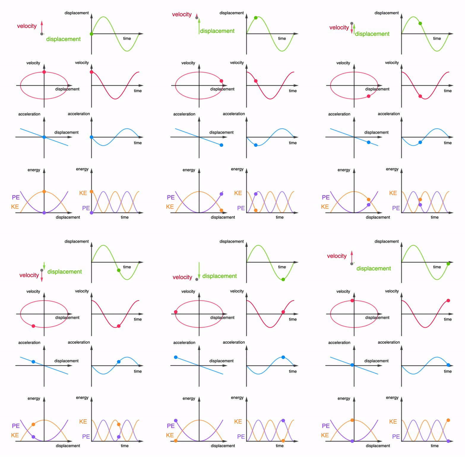
Simple harmonic motion graphs including energy
I have added two more graphs into the interactive animation. However, the app has become a bit sluggish when changing the period or amplitude. It still works smoothly when viewing the animation.
Students ought to find it useful to look at all the graphs together instead of in silo. This way, they can better understand the relationships between the graphs.
Here is an animated gif for use on powerpoint slides etc.

Views: 0
Likes: 0
Comments