Teaching Resources

Physics teaching resources

Manometer Simulation using GeoGebra

After trying to create a javascript simulation for the manometer using ChatGPT, I decided to return to GeoGebra, a platform that I am more used to, to create this interactive with more customisation. It comes with a ruler and a self-assessment feature for students to key in the value of pressure.

https://www.geogebra.org/m/qyuncz3h

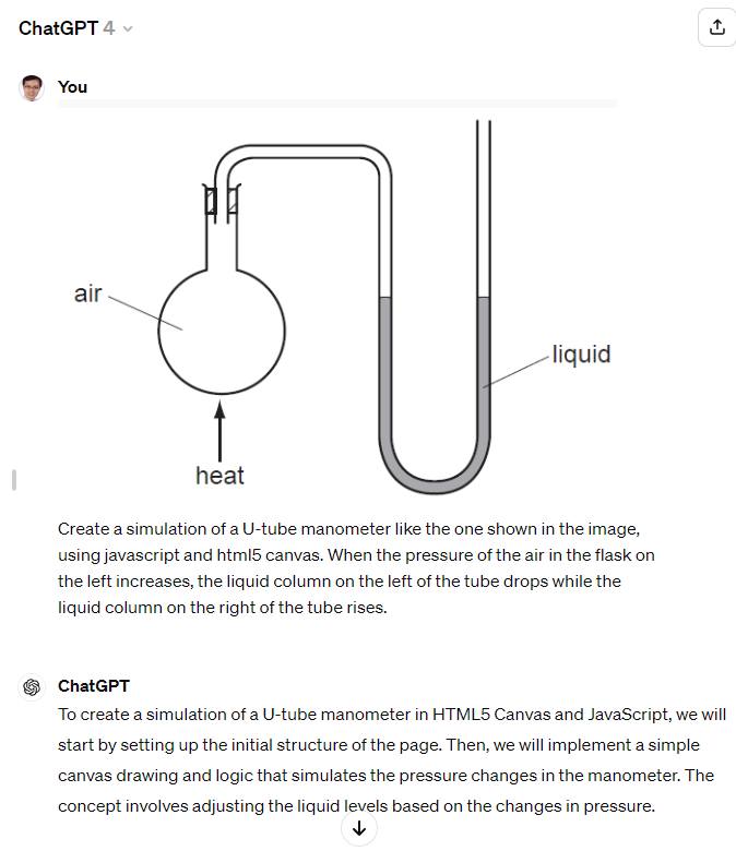
A U-tube manometer is a fundamental device used to measure pressure differences in fluid systems with simplicity and precision. It consists of a U-shaped tube typically made from transparent glass or plastic, allowing for clear observation of fluid levels within the tube. The tube is partially filled with a manometric fluid such as mercury or water, chosen based on the expected pressure range and application. The manometer has a graduated scale for measuring the height difference between the fluid levels in the two arms of the U-tube. The device is connected at two points where the pressure difference needs to be assessed, such as in gas pipelines, liquid tanks, or other systems requiring pressure monitoring.

When the manometer is connected to the pressure sources, the fluid within the U-tube will adjust its levels until equilibrium is achieved, with one side rising and the other side falling. The difference in height between the two columns of fluid (h) indicates the pressure difference. This difference is read using the graduated scale and is used to calculate the pressure difference (ΔP) with the formula ΔP = ρgh, where ρ is the density of the manometric fluid, and g is the acceleration due to gravity.

U-tube Manometer – a ChatGPT-Generated Simulation

I wanted a simple manometer simulation for the Sec 3 topic of Pressure and decided to try generating one with ChatGPT3.5. The first attempt, using just words, resulted in many errors such as single lines instead of 2D objects being used to represent the tubes and coloured bars that move in the wrong direction.

However, after I switched to ChatGPT4 and uploaded an image for reference, it was then able to produce a proper design consisting of glass tubes and coloured columns that move up and down with pressure changes in a flask. With a bit of UI changes using further prompts, this was the final product.


Link

The following is the screenshot showing the image that was uploaded as well as the initial prompt.

Analogue Meter Template

This GeoGebra applet (https://www.geogebra.org/m/watavkq8) can serve as a template for an analogue meter.

I added a check for the text input so that users have to key in the correct number of decimal places according to the precision of the instrument. For instance, a reading of 1 V should be recorded as 1.00 V and 1.5 V recorded as 1.50 V. Users need to read to half the smallest division, e.g. if the needle is between 2.4 and 2.5, they should input 2.45 V.

Creating a Python App with Glowscript using ChatGPT

Fleming’s Left-Hand Rule is a visual way to remember the direction of force on a current-carrying conductor in a magnetic field. In this rule, the thumb, forefinger, and middle finger of your left hand are held at right angles to each other. The thumb represents the direction of the force, the forefinger the direction of the magnetic field, and the middle finger the direction of the current.

To visualize this with GlowScript’s VPython, I used ChatGPT to generate a 3D scene with arrows representing each of these directions.

The prompts used were

Generate a glowscript python code for visualising fleming’s left-hand rule.

Use mouse or finger interactions to rotate the scene

Include a toggle to switch from the left-hand rule to the right hand rule.

Link

Stationary Wave Interactive using ChatGPT

I wanted to challenge ChatGPT to produce a complex interactive in order to prove that it is possible for teachers without much programming background to work with it as well.

This time, it was a lot more trial and error. The first major problem was when I thought the usual javascript library for graphs, Chart.JS would work. However, what I produced as a wonky wave in both directions that somehow attenuated as it travelled even though the equation of the waves did not have a decay factor.

The equation was generated by ChatGPT but looked like a normal sinusoidal function to me:

var y1 = Math.sin(2 * Math.PI * x / wavelength - 2 * Math.PI * time / period);

This is what the wonky graph looks like:

My suspicion is that Chart.JS makes use of points to form the curve so animating so many points at one go put too much demand on the app.

I then asked ChatGPT to suggest a different library. It then proceeded to make a new app with Plotly.JS, which works much better with moving graphs. This impressed me. I am learning so much with this new workflow. The final interactive graph can be found here:

I decided to add more functions after the first page was ready. While it took me about an hour to get the first page right with about 15 iterations mainly due to the wrong javascript library used, adding in more sliders to make the interactive more complex with variable wavelengths, periods and amplitudes took less than 10 minutes.

I shall just share the prompts that were given after I realised that plotly.js is the way to go.

Prompts for the index page:

  1. Create a graph using plotly.js with a vertical axis for displacement of wave particles and a horizontal axis for distance moved by a wave. .
  2. Draw the curve of an infinitely long transverse wave moving along the horizontal axis.
  3. Create another infinitely long transverse wave of the same wavelength moving in the opposite direction along the same horizontal axis. Represent them in different colours.
  4. Use a slider to change the period of oscillation of both waves and another slider to change the wavelength of the waves.
  5. Each wave should have the same wavelength.
  6. Revised prompt: Keep the vertical axis fixed in height, equal to the maximum possible amplitude of the third wave.
  7. Revised prompt: Keeep the legend of the chart to the bottom so that the horizontal axis length is fixed at 640 pixels

Prompts for the second page:

  1. Have separate sliders for the amplitudes, periods and wavelengths of wave 1 and wave 2.
  2. Display the values of the sliders next to them.

Kinematics Graphs with Variable Initial Velocity and Acceleration

I used ChatGPT to create this simple interactive graph. Including the time taken to make 2 rounds of refinement using more prompts and the time it took to deploy it via Github, it took about 15 minutes from start to end.

The first prompt I used was :

Create a graph using chart.js with vertical axis being “displacement / m” and horizontal axis being “time / s”. There should be a slider for the initial velocity value ranging from 0 to 2 m/s, a slider for the acceleration value ranging from -2 m/s^2 to 2 m/s^2. The displacement will start from zero and will follow a function dependent on the initial velocity and acceleration values from the slider. Draw the line of the displacement on the graph. Update the graph whenever the sliders are moved.

The results of the first attempt is shown above. It is already functional, with the initial velocity and acceleration sliders working together to change the shape of the graph.

The function it used to calculate displacement is based on the kinematics equation $s = ut + \dfrac{1}{2}at^2$, written as

    displacement.push(0.5 * acceleration * t * t + initialVelocity * t);

After the first successful attempt, I gave some refinement prompts like:

Show the values of the velocity and acceleration, along with the units.

Use drop-down list to change the vertical axis to velocity or acceleration, updating the axis each time and the curve as well.

So the second attempt looked like this

ChatGPT got 1 out of 2 requests correct. The values of the velocity and acceleration were intended to be displayed next to the sliders. It must have been because I was not clear enough. Hence, the last refinement I asked for was :

Give the codes to show the values of velocity and acceleration next to the sliders. Just those codes.

I didn’t want to get ChatGPT to generate the entire page of html and javascript again so I targetted the specific codes that I needed to change.

It was helpful in telling me where to update these codes. So at the end of the day, this is what was obtained after I made some manual tweaks to change the way the unit is displayed (e.g. m s-2 instead of m/s2):

It was good enough for my purpose now. The web app can be sent to students as a link (https://physicstjc.github.io/sls/kinematics-graph) or embedded into SLS as a standalone app. For use in SLS, do note the following:

  1. The html file must be named index.html
  2. The chart.js file must be copied and saved in the same zipped file at the same level as the index.html file. Change the path of the Chart JS from <script src=”https://cdnjs.cloudflare.com/ajax/libs/Chart.js/3.7.0/chart.min.js”></script> to <script src=”chart.min.js”></script>.
  3. For reference, this is what it looks like when zipped.