This simulation offers a clear and interactive way to explore the motion of a ball bouncing on the ground, highlighting how displacement, velocity, and acceleration change over time. On the left, you’ll see the animation of the ball with vectors showing its position (green), velocity (pink), and acceleration (blue). The sliders at the top allow you to adjust the starting height, the percentage of energy lost on each bounce, and whether air resistance is included. You can pause, reset, or let the motion run continuously, while the time slider doubles as a scrubber when the simulation is paused.
On the right, the three graphs display how each physical quantity varies with time. The position–time graph shows the ball’s vertical displacement, always measured relative to the lowest point of its center of mass. The velocity–time graph alternates between negative and positive values, reflecting the downward and upward motion during each bounce, while the acceleration–time graph remains mostly constant at –g, with spikes at the moment of collision. Together, the animation and graphs help link the visual motion with the quantitative data, reinforcing the relationships between these variables.
The underlying theory follows Newton’s laws of motion. The ball accelerates downwards under gravity until it collides with the ground, where it loses some energy depending on the restitution factor. This is why the bounce height diminishes over time. The velocity vector shows not only the speed but also the direction of motion, while the acceleration vector indicates that gravity always acts downward, regardless of whether the ball is rising or falling. By adjusting energy loss during each collision and air resistance, you can model more realistic scenarios and see how dissipative forces affect motion, making this a powerful tool to visualize the physics of bouncing objects.
Exploring Wave Properties Through Interactive Simulations
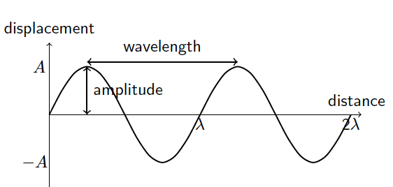
One of the most powerful ways to learn about waves is not just by reading definitions, but by seeing them in action. This simulation allows you to adjust amplitude, frequency, wavelength, and speed and watch how the wave’s behavior changes over time and space.
By the end of this activity, you should be able to:
Define and use the terms speed, frequency, wavelength, period, and amplitude, and connect them to what you see on the graphs.
Recall and apply the relationship $v = f \lambda$ to new situations and solve related problems.
How to Interact With the Simulation
Two Graphs, Two Perspectives
The top graph (Displacement vs Distance) shows the shape of the wave along space at a single instant.
The bottom graph (Displacement vs Time) shows how a single particle moves up and down as time passes.
Controls
Use the sliders to change Amplitude, Frequency, Wave Speed, and Wavelength.
Press Start Animation to see the wave move. Press it again to stop.
Press Reset to return to default values.
What happens when you…
Increase Amplitude → The wave gets taller, but the speed and wavelength stay the same.
Increase Frequency → More oscillations appear in the same time, and the particle on the time graph moves faster up and down.
Change Wavelength → The distance between crests and troughs changes on the distance graph.
Change Speed → The wave travels faster across the distance graph.
Use these questions as you experiment with the sliders:
Amplitude
How does increasing amplitude affect the wave’s appearance on both graphs?
Does amplitude change the wave speed?
Frequency and Period
Observe the bottom graph: How many oscillations occur in one second when frequency is 1 Hz? What is the period (time for one cycle)?
What happens to the period when you double the frequency?
Wavelength
On the top graph, how do the positions of the crests and troughs change as you adjust the wavelength slider?
Can you measure one wavelength directly from the graph?
Wave Speed Relationship
Try setting frequency = 2 Hz and wavelength = 150 mm. What is the predicted wave speed using $v = f \lambda$
Now observe the simulation: Does the wave move across the distance graph at that speed?
Repeat for another set of values (e.g. f=0.5 Hz, λ=300 mm). Does the relationship still hold?
Connecting Both Graphs
Watch the red dot on the distance graph (a fixed point on the medium). How does its motion compare with the displacement–time graph?
Why does the red dot’s vertical motion look like a sine wave over time?
A simulation based on the casting of dice can be used to demonstrate the concept of half-life. Imagine a certain number of dice being cast together. All the dice that show a six are removed from the population. The remainder are cast again repeatedly, and each time, those that show a six are removed.
The question posed to students is : around which cast will the number of dice be reduced to half the original?
Open simulation here. This was built using Claude.AI, which I notice, is better at suggesting UI features than ChatGPT or Gemini. I did not put too much effort into this as I only wanted to explain to upper sec IP students why intermolecular forces need not always be attractive, as well as to link it to the potential energy between particles in the kinetic particle model of matter.
This deck of slides are the ones I will be using for the Symposium on “Leveraging Technology for Engaging and Effective Learning” at the Singapore International Science Teachers’ Conference (SISTC) 2024 on Day 2 of the Conference (20 November). Feel free to download for your reference.
In recent years, AI tools like DALL-E and MidJourney have gained popularity for generating stunning, artistic images. However, when it comes to creating scientific illustrations, particularly for exams, we need accuracy, clarity, and precision. This is where LaTeX, a document preparation system widely used in academia, shines. Combined with the intelligence of ChatGPT, LaTeX can produce exactly the images you need without the artistic flair or ambiguity that tools like DALL-E might introduce.
The process of generating science exam images using ChatGPT and LaTeX is straightforward:
Describe the Diagram: You begin by providing a detailed description of the diagram or scientific illustration you need. For example, “Generate a diagram using Latex showing a free-body diagram of a block on an inclined plane with friction.”
ChatGPT Generates LaTeX Code: Based on your description, ChatGPT can generate the appropriate LaTeX code, using packages like TikZ or PGFPlots to create the required scientific diagram. The output might look like this: \documentclass{standalone} \usepackage{tikz} \begin{document} \begin{tikzpicture} % Inclined plane \draw[thick] (0,0) -- (4,2); \draw[thick] (0,0) -- (4,0); % Block \draw[fill=gray] (2,1) rectangle (2.5,1.5); % Forces \draw[->,thick] (2.25,1.25) -- (2.25,2.25) node[above] {Normal Force}; \draw[->,thick] (2.25,1.25) -- (2.25,0.25) node[below] {Weight}; \draw[->,thick] (2.25,1.25) -- (3.25,1.25) node[right] {Friction}; \end{tikzpicture} \end{document}
Compile the LaTeX Code: Once the code is generated, you can compile it using any LaTeX editor (such as Overleaf or a local LaTeX distribution).
Check for Errors: The diagram is unlikely to look perfect in the first iteration. For example, the above code gives the following:
Edit: You can either instruct ChatGPT to modify specific sections of the diagram or make the changes yourself. After 3 more iterations, for example, ChatGPT produced the following codes: \begin{tikzpicture} % Inclined plane \draw[thick] (0,0) -- (4,2); \draw[thick] (0,0) -- (4,0); % Block (rotated to match the slope) \draw[fill=gray, rotate around={26.565:(2.25,1.25)}] (2,1) rectangle (2.5,1.5); % Forces (adjusted for friction up the slope) % Normal Force (perpendicular to the slope) \draw[->,thick] (2.25,1.25) -- ++(-0.447,0.894) node[above left] {Normal Force}; % Weight (straight down) \draw[->,thick] (2.25,1.25) -- (2.25,0.25) node[below] {Weight}; % Friction (along the slope, now pointing up the incline) \draw[->,thick] (2.25,1.25) -- ++(0.894,0.447) node[above right] {Friction}; \end{tikzpicture}
This is the output image:
Integrate into Teaching Materials: Once you are satisfied with the output, the compiled image can then be saved as a PDF, PNG, or any other image format and directly embedded into your exam materials.
The following are similar images made using the same workflow and their corresponding codes, which I made changes to manually instead as it was faster for me once I became familiar with the coordinate-system based drawing method.