Drag the ammeter (A) or voltmeter (V) onto a bulb to attach.
Ammeter measures current inline; voltmeter measures voltage across the bulb.
This interactive simulation helps students compare what happens in series and parallel circuits using two bulbs and a 6 V battery. Learners can switch between series and parallel configurations, adjust the resistance of each bulb, and see how this affects the current, voltage and brightness of the bulbs. By dragging the ammeter (A) into the circuit, they can measure the current through a chosen bulb, and by placing the voltmeter (V) across a bulb, they can measure the potential difference across it. The changing brightness of each bulb represents the power it dissipates, allowing students to visualise ideas such as: in a series circuit the current is the same through all components but the voltage is shared, while in a parallel circuit the voltage across each branch is the same but the currents can be different.
This simulation lets you watch two equal-size spheres (light and heavy) fall, while you see their free-body diagrams (FBDs) and a velocity–time graph update in real time.
Press Start to run and Pause to discuss a moment in time. Reset restarts from rest. Use Zoom to read the force vectors clearly. Toggle Air Resistance to compare an idealised fall (no drag) with a more realistic one (drag on). The small info panel shows the current speeds and, when drag is on, each sphere’s terminal velocity.
What to look for
Without air resistance: Each FBD shows only weight downward. Acceleration is constant at ggg, so the velocity–time graph is a straight line from the origin for both spheres (same slope, because mass doesn’t matter when no drag acts).
With air resistance: A drag arrow appears upward and grows with speed. The heavy sphere’s velocity rises faster at first (its weight is larger), but both curves flatten as drag increases, and the acceleration vector shrinks toward zero. Dotted segments indicate when the two curves overlap closely.
Theory in one breath
In air, we model drag as proportional to speed: $F_\text{drag}=kv$
Net force is $ma=mg−kv \quad\Rightarrow a=g−\dfrac{k}{m}v$
As v grows, the term $\dfrac{k}{m}v$ eats into $g$, so acceleration falls.
Terminal velocity happens when forces balance: $mg=kv$, so $v_t=\dfrac{mg}{k}$
Heavier mass ⇒ larger $v_t$. That’s why the heavy sphere ultimately settles at a higher speed and takes longer to level off. With drag off, the model is simply $a=g$ and $v=gt$.
How to teach with it (fast)
Start with Air Resistance off: Pause after a second—ask why both lines match and why only weight appears on the FBDs.
Turn Air Resistance on: Run, then pause midway. What changed in the FBDs? Why is acceleration smaller now?
Let it run until the acceleration vectors nearly vanish: connect “flat graph” with “balanced forces,” then read off different terminal velocities.
That’s it: start, pause, notice which vector changed, and link the picture to the equation.
Following a previous simulation on charging by induction, this simulation allows students to investigate the effects of performing the actions of bringing or removing a charged rod near a pair of conducting cans that can be placed in contact or separated-in any order they choose. Each sequence produces a distinct outcome: the cans may finish with opposite charges or both neutral. The simulation makes the invisible electron shifts clear, helping learners see exactly when charge flows between cans and when it merely redistributes inside a single conductor.
The above screenshot shows one possible state of the charges after a particular sequence of buttons are clicked. Could you figure out what is the order of buttons pressed?
Heating and cooling curves are graphical representations that show how the temperature of a substance changes as heat is added or removed over time. They illustrate the behavior of substances as they go through different states—solid, liquid, and gas.
Heating Curve: This curve shows how the temperature of a substance increases as it absorbs heat. The curve typically rises as the substance heats up, with plateaus indicating phase changes, where the substance absorbs energy but its temperature remains constant. Check out the heating curves for water and nitrogen using the drop-down menu.
Cooling Curve: This curve is the opposite of the heating curve. It shows how the temperature decreases as the substance loses heat. Like the heating curve, it also has plateaus where phase changes occur, but this time, the substance releases energy. In addition to water, you can also see the cooling curve for ethanol.
With these ChatGPT-generated interactive graphs, users can change the rate of heat input or released from the substance. They can also read the descriptions that explain the changes in the average PE and KE of the molecules during each process.
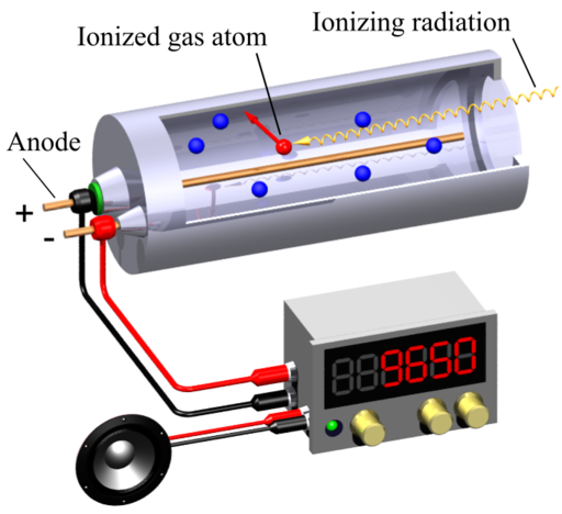
A Geiger-Muller (GM) counter is an instrument for detecting and measuring ionizing radiation. It operates by using a Geiger-Muller tube filled with gas, which becomes ionized when radiation passes through it. This ionization produces an electrical pulse that is counted and displayed, allowing users to determine the presence and intensity of radiation.
This simulation (find it at https://physicstjc.github.io/sls/gm-counter) allows students to explore the random nature of radiation and the significance of accounting for background radiation in experiments. Here’s a guide to help students investigate these concepts using the simulation.
Exploring Background Radiation
Q1: Set the source to “Background” and start the count. Observe the count for a few minutes. What do you notice about the counts recorded?
A1: The counts recorded are relatively low and vary randomly. This reflects the background radiation which is always present.
Q2: Why is it important to measure background radiation before testing other sources?
A2: Measuring background radiation is important to establish a baseline level of radiation. This helps in accurately identifying and quantifying the additional radiation from other sources.
Investigating a weak source (e.g. banana) as a Radiation Source
Q3: Change the source to “Weak Source ” and reset the data. Start the count and observe the readings. How do the counts from the banana compare to the background radiation?
A3: The counts from the weak source are higher than the background radiation. Did you know that bananas contain a small amount of radioactive potassium-40?
Q4: How do the counts per minute (CPM) for the weak source vary over time? Is there a pattern or do the counts appear random?
A4: The counts per minute (CPM) will increase for the first 60 seconds and stabilise slightly after that. The counts per minute for the weak source vary over time and appear random, reflecting the stochastic nature of radioactive decay.
Exploring a strong source, e.g. Cesium-137 Source
Q5: Set the source to “Strong Source” and reset the data. Start the count and observe the readings. How do the counts from the strong source compare to both the background radiation and the weak source?
A5: The counts from the strong source are significantly higher than both the background radiation and the weak source.
Understanding the Random Nature of Radiation
Q6: By looking at the sample counts, can you predict the next count value? Why or why not?
A6: No, you cannot predict the next count value because radioactive decay is a random process. Each decay event is independent of the previous ones.
Q7: How can you use the background radiation measurement to correct the readings from the sources?
A8: You can subtract the average background CPM from the CPM of the sources to get the corrected readings, isolating the radiation from the specific sources.
I wanted to challenge ChatGPT to produce a complex interactive in order to prove that it is possible for teachers without much programming background to work with it as well.
This time, it was a lot more trial and error. The first major problem was when I thought the usual javascript library for graphs, Chart.JS would work. However, what I produced as a wonky wave in both directions that somehow attenuated as it travelled even though the equation of the waves did not have a decay factor.
The equation was generated by ChatGPT but looked like a normal sinusoidal function to me:
var y1 = Math.sin(2 * Math.PI * x / wavelength - 2 * Math.PI * time / period);
This is what the wonky graph looks like:
My suspicion is that Chart.JS makes use of points to form the curve so animating so many points at one go put too much demand on the app.
I then asked ChatGPT to suggest a different library. It then proceeded to make a new app with Plotly.JS, which works much better with moving graphs. This impressed me. I am learning so much with this new workflow. The final interactive graph can be found here:
I decided to add more functions after the first page was ready. While it took me about an hour to get the first page right with about 15 iterations mainly due to the wrong javascript library used, adding in more sliders to make the interactive more complex with variable wavelengths, periods and amplitudes took less than 10 minutes.
I shall just share the prompts that were given after I realised that plotly.js is the way to go.
Prompts for the index page:
Create a graph using plotly.js with a vertical axis for displacement of wave particles and a horizontal axis for distance moved by a wave. .
Draw the curve of an infinitely long transverse wave moving along the horizontal axis.
Create another infinitely long transverse wave of the same wavelength moving in the opposite direction along the same horizontal axis. Represent them in different colours.
Use a slider to change the period of oscillation of both waves and another slider to change the wavelength of the waves.
Each wave should have the same wavelength.
Revised prompt: Keep the vertical axis fixed in height, equal to the maximum possible amplitude of the third wave.
Revised prompt: Keeep the legend of the chart to the bottom so that the horizontal axis length is fixed at 640 pixels
Prompts for the second page:
Have separate sliders for the amplitudes, periods and wavelengths of wave 1 and wave 2.
